Foreword
This book is currently a WIP
Welcome to the official book for the Yarrow GUI framework!
Yarrow is a modern retained-mode GUI library in Rust with extreme performance and control, geared towards audio software. It was built to power the upcoming Meadowlark DAW.
The repository for the project is located at https://github.com/MeadowlarkDAW/Yarrow.
Getting Started
Installing Rust
The Yarrow framework is built using the Rust programming language. To use Yarrow, you must install the Rust compiler by following the instructions over at https://www.rust-lang.org/learn/get-started.
Running the Examples
The Yarrow repository on github contains some example applications. To run these examples, first clone the repository and enter the root directory of the project in a terminal:
git clone https://github.com/MeadowlarkDAW/Yarrow.git
cd Yarrow
Then run the following command:
cargo run --example <name_of_example>
Where <name_of_example> should be replaced with the example name, for example:
cargo run --example gallery
The first compile may take quite a while as it is compiling an entire GUI library from scratch. Subsequent compiles should be much faster.
Join the Community
If you have any questions about Yarrow or you wish to contribute, come join us on the Meadowlark Discord Server under the #yarrow channel.
Quick Start Tutorial
This chapter will walk you through the basics of Yarrow by creating a simple counter application.
This book is not meant as an introduction to the Rust programming language. If you are new to Rust, it is highly recommended to first read through the official Rust book. More Rust learning resources can also be found at https://www.rust-lang.org/learn.
The full source code of the completed tutorial can be found here.
Setting Up
First, create a new Rust project with the following command:
cargo new --bin hello_yarrow
Adding Yarrow as a dependency
In the newly created directory, open the Cargo.toml file and add the following under [dependencies]:
[package]
name = "hello_yarrow"
version = "0.1.0"
edition = "2021"

[dependencies]
yarrow = { git = "https://github.com/MeadowlarkDAW/Yarrow.git", rev = "5b14326ea41e762a7b941147d0c7d32279abc63b" }
Yarrow does not have a recent version published on crates.io yet, so you will need to use the git version for now.
You can update the revision number to the latest commit hash from the GitHub repository. You can also choose to instead use
branch = "main", but keep in mind this may introduce breaking changes.
Enabling Additional Optimizations
Some aspects of Yarrow such as text shaping can run very slow when compiled in debug mode without any optimizations. It is recommended to add the follow to your Cargo.toml file to get acceptable performance when running in debug mode:
[profile.dev]
opt-level = 1
This tells cargo to enable a small amount of optimizations when compiling in debug mode. You can learn more about cargo profiles here.
Initializing the Application
In main.rs, replace the default contents with the following:
use yarrow::prelude::*; // 1

#[derive(Clone)]
pub enum MyAction {} // 2

#[derive(Default)]
struct MyApp {} // 3

impl Application for MyApp { // 4
    type Action = MyAction; // 5
}

pub fn main() {
    let (action_sender, action_receiver) = yarrow::action_channel(); // 6

    // 7
    yarrow::run_blocking(MyApp::default(), action_sender, action_receiver).unwrap();
}
Here is a breakdown of what is happening:
- Import a bunch of types from Yarrow. For simplicity, Yarrow provides a
preludemodule that re-exports most of everything you need. - Our application's Action enum type. We will cover what actions are and how they work later in this tutorial. For now we have no actions, so leave it empty. (Note that your action type must implement
Clone.) - Our application struct. This is where we will store everything related to our application.
- The
yarrow::Applicationtrait. We must implement this for our application object. - Define the type to use as our applications's action enum.
- Create an action channel. This is essentially an mpsc channel from Rust's standard library.
- Run the application. For standalone applications you will want to use
run_blocking, but Yarrow contains other methods for running in different contexts (like an audio plugin).
Running the Application
Now run the application using the command cargo run. Once it finishes compiling you should see an empty black window.
The first compile may take quite a while as it is compiling an entire GUI library from scratch. Subsequent compiles should be much faster.
Yarrow is still experimental software. If you run into any issues while compiling or running this code, please create an issue in the github repository.
Your First Element
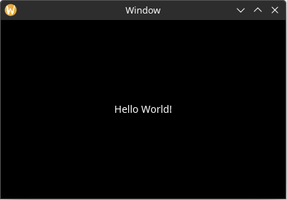
Let's start by adding a Label element with the text "Hello World!".
A Place to Store our Elements
First we will need to create a struct to hold our elements for the main window. Add the following struct, and add it as a field in MyApp:
use yarrow::prelude::*;

#[derive(Clone)]
pub enum MyAction {}

#[derive(Default)]
struct MyApp {
    main_window_elements: Option<MainWindowElements>, // new
}

impl Application for MyApp {
    type Action = MyAction;
}

pub struct MainWindowElements {
    hello_label: Label,
}

pub fn main() {
    let (action_sender, action_receiver) = yarrow::action_channel();

    yarrow::run_blocking(
        MyApp::default(),
        action_sender,
        action_receiver,
    )
    .unwrap();
}
So why can't we just add hello_label directly to our MyApp struct? The reason is that Yarrow applications are designed to work even when the main window isn't open. Not only is this a useful concept for audio plugins, but this allows the same behavior to work for both the main window and any child windows in our application (Yarrow has first-class multi-window support!)
The Build Function
Now we must define a function to "build" our elements when the window opens. To do this, add the following method to MainWindowElements, and call this build function from the on_window_event trait method:
use yarrow::prelude::*;

#[derive(Clone)]
pub enum MyAction {}

#[derive(Default)]
struct MyApp {
    main_window_elements: Option<MainWindowElements>, // new
}

impl Application for MyApp {
    type Action = MyAction;

    // new
    fn on_window_event(
        &mut self,
        event: AppWindowEvent,
        window_id: WindowID,
        cx: &mut AppContext<MyAction>,
    ) {
        match event {
            AppWindowEvent::WindowOpened => {
                if window_id == MAIN_WINDOW { // 1
                    let mut cx = cx.window_context(MAIN_WINDOW).unwrap(); // 2

                    self.main_window_elements =
                        Some(MainWindowElements::build(&mut cx)); // 3
                }
            }
            _ => {}
        }
    }
}

pub struct MainWindowElements {
    hello_label: Label,
}

impl MainWindowElements {
    pub fn build(cx: &mut WindowContext<'_, MyAction>) -> Self {
        todo!()
    }
}

pub fn main() {
    let (action_sender, action_receiver) = yarrow::action_channel();

    yarrow::run_blocking(
        MyApp::default(),
        action_sender,
        action_receiver,
    )
    .unwrap();
}- Check the ID of the window to see if it is the main window. This will always be the case for our simple app, but this won't be the case if we add more windows in the future.
- Get the context for the main window. This context is what we add elements to.
- Build the main window elements and store it in our application struct.
Building the Label Element
Now we finally get to build the label! Inside MainWindowElements::build, add the following:
use yarrow::prelude::*;

#[derive(Clone)]
pub enum MyAction {}

#[derive(Default)]
struct MyApp {
    main_window_elements: Option<MainWindowElements>,
}

impl Application for MyApp {
    type Action = MyAction;

    fn on_window_event(
        &mut self,
        event: AppWindowEvent,
        window_id: WindowID,
        cx: &mut AppContext<MyAction>,
    ) {
        match event {
            AppWindowEvent::WindowOpened => {
                if window_id == MAIN_WINDOW {
                    let mut cx = cx.window_context(MAIN_WINDOW).unwrap();

                    self.main_window_elements =
                        Some(MainWindowElements::build(&mut cx));
                }
            }
            _ => {}
        }
    }
}

pub struct MainWindowElements {
    hello_label: Label,
}

impl MainWindowElements {
    pub fn build(cx: &mut WindowContext<'_, MyAction>) -> Self {
        // changed
        Self {
            hello_label: Label::builder() // 1
                .text("Hello World!") // 2
                .build(cx), // 3
        }
    }
}

pub fn main() {
    let (action_sender, action_receiver) = yarrow::action_channel();

    yarrow::run_blocking(MyApp::default(), action_sender, action_receiver).unwrap();
}- All included elements in Yarrow use the builder pattern.
- Elements can include any custom property in their builders. In this case we use the
textproperty to set the text of the label. - Finally, finish building the element by adding it to the window context.
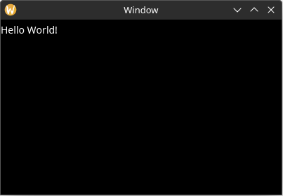
Static Layout
If you run the application now, you will see that the window is still blank. This is because in order for elements to become active and be rendered, they must have a defined "bounding rectangle".
You can add a bounding rectangle by using the rect property on the label builder like this. Now the label is visible when the app is run.
use yarrow::prelude::*;

#[derive(Clone)]
pub enum MyAction {}

#[derive(Default)]
struct MyApp {
    main_window_elements: Option<MainWindowElements>,
}

impl Application for MyApp {
    type Action = MyAction;

    fn on_window_event(
        &mut self,
        event: AppWindowEvent,
        window_id: WindowID,
        cx: &mut AppContext<MyAction>,
    ) {
        match event {
            AppWindowEvent::WindowOpened => {
                if window_id == MAIN_WINDOW {
                    let mut cx = cx.window_context(MAIN_WINDOW).unwrap();

                    self.main_window_elements =
                        Some(MainWindowElements::build(&mut cx));
                }
            }
            _ => {}
        }
    }
}

pub struct MainWindowElements {
    hello_label: Label,
}

impl MainWindowElements {
    pub fn build(cx: &mut WindowContext<'_, MyAction>) -> Self {
        Self {
            hello_label: Label::builder()
                .text("Hello World!")
                .rect(rect(0.0, 0.0, 100.0, 30.0)) // new
                .build(cx),
        }
    }
}

pub fn main() {
    let (action_sender, action_receiver) = yarrow::action_channel();

    yarrow::run_blocking(MyApp::default(), action_sender, action_receiver).unwrap();
}
If we want to place the label in a different position, all we need to do is change the (x, y) values in the bounding rect:
.rect(rect(100.0, 40.0, 100.0, 30.0))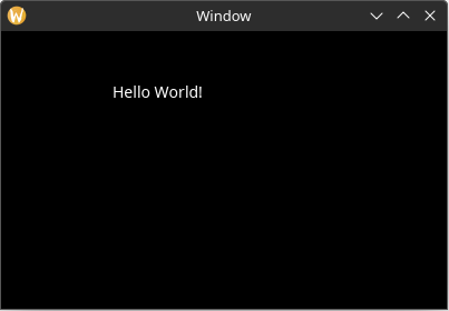
Also note that if we make the (width, height) values in the bounding rect small enough, the text will be clipped:
.rect(rect(100.0, 40.0, 55.0, 10.0))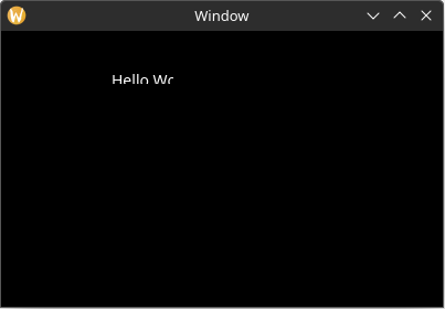
Dynamic Layout
Setting the bounding rectangle via the element builder works fine for static content, but what if we wanted the layout to dynamically change due to a change in the application state (or the window being resized)? And for that matter, what if we wanted to layout other elements based on the size of the text in the label element?
To achieve this, we will define a "layout function" for our main window. Remove the .rect property from the Label builder and then add the following method to MainWindowElements:
use yarrow::prelude::*;

#[derive(Clone)]
pub enum MyAction {}

#[derive(Default)]
struct MyApp {
    main_window_elements: Option<MainWindowElements>,
}

impl Application for MyApp {
    type Action = MyAction;

    fn on_window_event(
        &mut self,
        event: AppWindowEvent,
        window_id: WindowID,
        cx: &mut AppContext<MyAction>,
    ) {
        match event {
            AppWindowEvent::WindowOpened => {
                if window_id == MAIN_WINDOW {
                    let mut cx = cx.window_context(MAIN_WINDOW).unwrap();

                    self.main_window_elements =
                        Some(MainWindowElements::build(&mut cx));
                }
            }
            _ => {}
        }
    }
}

pub struct MainWindowElements {
    hello_label: Label,
}

impl MainWindowElements {
    pub fn build(cx: &mut WindowContext<'_, MyAction>) -> Self {
        Self {
            hello_label: Label::builder()
                .text("Hello World!")
                .build(cx),
        }
    }

    // ...

    // new
    pub fn layout(&mut self, cx: &mut WindowContext<'_, MyAction>) {
        let label_size = self.hello_label.desired_size(cx.res); // 1

        // Center the label inside the window
        let window_rect = Rect::from_size(cx.logical_size()); // 2
        let label_rect = centered_rect(window_rect.center(), label_size); // 3

        self.hello_label.el.set_rect(label_rect); // 4
    }
}

pub fn main() {
    let (action_sender, action_receiver) = yarrow::action_channel();

    yarrow::run_blocking(MyApp::default(), action_sender, action_receiver).unwrap();
}- The
desired_sizemethod can be used to get the desired size of any element with text content (or some other dynamically sized content). This value is automatically cached by the element, so it is relatively inexpensive to call it over and over again if need be. - Get the size of the window from the window context. Also convert that size into a rectangle for ease of use later (Yarrow uses euclid for geometric types).
- Create a rectangle that is centered inside of
window_rectusing the provided helper method. - Set the bounding rectangle via the label element's handle. Note the
.elin the middle. Every element handle has a genericelfield with generic methods that are shared by all element types. For example, the genericelfield also has arect()method that can retrieve the current bounding rectangle of the element, which is very useful when the layout of some elements depend on the layout of other elements.
Also note that setting the bounding rectangle via the element's handle will not trigger an update in Yarrow's system unless that rectangle has changed. Therefore you can still get good performance even when you have a single layout function like this. However, if the performance still isn't good enough, you can change it to be as optimized and fine-grained as you wish. You are in control!
Note that the same effect can be achieved by using the
layout_alignedmethod on theLabelhandle:let window_rect = Rect::from_size(cx.logical_size()); self.hello_label.layout_aligned(window_rect.center(), Align2::CENTER, cx.res);
Now we must call that layout function after the main window is built and whenever the window resizes. To do this, add the following to the on_window_event trait method:
use yarrow::prelude::*;

#[derive(Clone)]
pub enum MyAction {}

#[derive(Default)]
struct MyApp {
    main_window_elements: Option<MainWindowElements>,
}

impl Application for MyApp {
    type Action = MyAction;

    fn on_window_event(
        &mut self,
        event: AppWindowEvent,
        window_id: WindowID,
        cx: &mut AppContext<MyAction>,
    ) {
        match event {
            AppWindowEvent::WindowOpened => {
                if window_id == MAIN_WINDOW {
                    let mut cx = cx.window_context(MAIN_WINDOW).unwrap();

                    self.main_window_elements =
                        Some(MainWindowElements::build(&mut cx));
                }
            }
            // ...

            // new
            AppWindowEvent::WindowResized => {
                if window_id == MAIN_WINDOW {
                    let mut cx =
                        cx.window_context(MAIN_WINDOW).unwrap();

                    self.main_window_elements
                        .as_mut()
                        .unwrap()
                        .layout(&mut cx);
                }
            }
            _ => {}
        }
    }
}

pub struct MainWindowElements {
    hello_label: Label,
}

impl MainWindowElements {
    pub fn build(cx: &mut WindowContext<'_, MyAction>) -> Self {
        Self {
            hello_label: Label::builder()
                .text("Hello World!")
                .build(cx),
        }
    }

    pub fn layout(&mut self, cx: &mut WindowContext<'_, MyAction>) {
        let label_size = self.hello_label.desired_size(cx.res); // 1

        // Center the label inside the window
        let window_rect = Rect::from_size(cx.logical_size()); // 2
        let label_rect = centered_rect(window_rect.center(), label_size); // 3

        self.hello_label.el.set_rect(label_rect); // 4
    }
}

pub fn main() {
    let (action_sender, action_receiver) = yarrow::action_channel();

    yarrow::run_blocking(MyApp::default(), action_sender, action_receiver).unwrap();
}
Now the label stays in the center of the window!
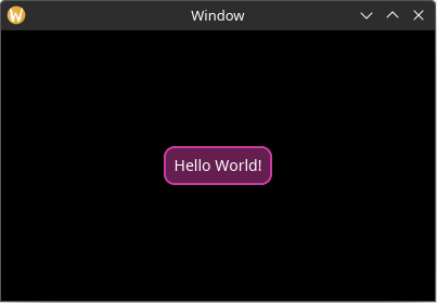
Adding Style
Now let's make the label more visually interesting.
To be more representative of a real-world application, let us define a struct to hold all of the style related information about our application. This struct has no fields yet, but we will add some later.
For now, let us define a method which loads the styles for the elements we want:
use yarrow::prelude::*;

#[derive(Clone)]
pub enum MyAction {}

#[derive(Default)]
struct MyApp {
    main_window_elements: Option<MainWindowElements>,
}

impl Application for MyApp {
    type Action = MyAction;

    fn on_window_event(
        &mut self,
        event: AppWindowEvent,
        window_id: WindowID,
        cx: &mut AppContext<MyAction>,
    ) {
        match event {
            AppWindowEvent::WindowOpened => {
                if window_id == MAIN_WINDOW {
                    let mut cx = cx.window_context(MAIN_WINDOW).unwrap();

                    self.main_window_elements =
                        Some(MainWindowElements::build(&mut cx));
                }
            }
            AppWindowEvent::WindowResized => {
                if window_id == MAIN_WINDOW {
                    let mut cx = cx.window_context(MAIN_WINDOW).unwrap();

                    self.main_window_elements
                        .as_mut()
                        .unwrap()
                        .layout(&mut cx);
                }
            }
            _ => {}
        }
    }
}

pub struct MainWindowElements {
    hello_label: Label,
}

impl MainWindowElements {
    pub fn build(cx: &mut WindowContext<'_, MyAction>) -> Self {
        Self {
            hello_label: Label::builder()
                .text("Hello World!")
                .build(cx),
        }
    }

    pub fn layout(&mut self, cx: &mut WindowContext<'_, MyAction>) {
        let label_size = self.hello_label.desired_size(cx.res); // 1

        // Center the label inside the window
        let window_rect = Rect::from_size(cx.logical_size()); // 2
        let label_rect = centered_rect(window_rect.center(), label_size); // 3

        self.hello_label.el.set_rect(label_rect); // 4
    }
}

#[derive(Default)]
struct MyStyle {}

impl MyStyle {
    pub fn load(&self, res: &mut ResourceCtx) { // 1
        res.style_system.add( // 2
            ClassID::default(), // 3
            true, // 4
            LabelStyle { // 5
                back_quad: QuadStyle {
                    bg: background_hex(0x641e50),
                    border: border(hex(0xc83ca0), 2.0, radius(10.0)),
                    ..Default::default()
                },
                text_padding: padding_all_same(10.0),
                ..Default::default() // 6
            },
        );
    }
}

pub fn main() {
    let (action_sender, action_receiver) = yarrow::action_channel();

    yarrow::run_blocking(MyApp::default(), action_sender, action_receiver).unwrap();
}- Pass in the
ResourceCtx, which is a context for the globally shared resources in a Yarrow application. - Add a style to the context's
StyleSystem. - The "class ID". Only elements that have this class ID will have this style applied to them. The default class ID means to set it as the default style for all elements of this type which don't have a defined class ID.
- Whether or not this style is a dark theme variant (true) or a light theme variant (false). This allows for easy switching between light and dark variants later.
- Every element type defines its own custom style struct with custom properties.
- The
..Default::default()syntax is handy for not defining properties you do not use.
Now store our new style struct in MyApp and load it when the application starts:
use yarrow::prelude::*;

#[derive(Clone)]
pub enum MyAction {}

#[derive(Default)]
struct MyApp {
    main_window_elements: Option<MainWindowElements>,
    style: MyStyle, // new
}

// ...

impl Application for MyApp {
    type Action = MyAction;

    fn on_window_event(
        &mut self,
        event: AppWindowEvent,
        window_id: WindowID,
        cx: &mut AppContext<MyAction>,
    ) {
        match event {
            AppWindowEvent::WindowOpened => {
                if window_id == MAIN_WINDOW {
                    // new
                    self.style.load(&mut cx.res);

                    let mut cx = cx.window_context(MAIN_WINDOW).unwrap();

                    self.main_window_elements =
                        Some(MainWindowElements::build(&mut cx));
                }
            }
            AppWindowEvent::WindowResized => {
                if window_id == MAIN_WINDOW {
                    let mut cx =
                        cx.window_context(MAIN_WINDOW).unwrap();

                    self.main_window_elements
                        .as_mut()
                        .unwrap()
                        .layout(&mut cx);
                }
            }
            _ => {}
        }
    }
}

pub struct MainWindowElements {
    hello_label: Label,
}

impl MainWindowElements {
    pub fn build(cx: &mut WindowContext<'_, MyAction>) -> Self {
        Self {
            hello_label: Label::builder()
                .text("Hello World!")
                .build(cx),
        }
    }

    pub fn layout(&mut self, cx: &mut WindowContext<'_, MyAction>) {
        let label_size = self.hello_label.desired_size(cx.res);

        // Center the label inside the window
        let window_rect = Rect::from_size(cx.logical_size());
        let label_rect = centered_rect(window_rect.center(), label_size);

        self.hello_label.el.set_rect(label_rect);
    }
}

#[derive(Default)]
struct MyStyle {}

impl MyStyle {
    pub fn load(&self, res: &mut ResourceCtx) {
        res.style_system.add(
            ClassID::default(),
            true,
            LabelStyle {
                back_quad: QuadStyle {
                    bg: background_hex(0x641e50),
                    border: border(hex(0xc83ca0), 2.0, radius(10.0)),
                    ..Default::default()
                },
                text_padding: padding_all_same(10.0),
                ..Default::default()
            },
        );
    }
}

pub fn main() {
    let (action_sender, action_receiver) = yarrow::action_channel();

    yarrow::run_blocking(MyApp::default(), action_sender, action_receiver).unwrap();
}
Now our label is looking fancy!
Loading a Theme
By default all elements have a style which is very bare-bones (and most of the time colors are set to transparent). If you want a quicker starting place, you can load one of Yarrow's built in themes. A "theme" is simply a function with a few tweakable parameters that adds a bunch of styles.
At the time of this writing, Yarrow has only one built-in theme called "Yarrow dark". To use it, simply add this inside of MyStyle::load():
use yarrow::prelude::*;

#[derive(Clone)]
pub enum MyAction {}

#[derive(Default)]
struct MyApp {
    main_window_elements: Option<MainWindowElements>,
    style: MyStyle,
}

impl Application for MyApp {
    type Action = MyAction;

    fn on_window_event(
        &mut self,
        event: AppWindowEvent,
        window_id: WindowID,
        cx: &mut AppContext<MyAction>,
    ) {
        match event {
            AppWindowEvent::WindowOpened => {
                if window_id == MAIN_WINDOW {
                    self.style.load(&mut cx.res);

                    let mut cx = cx.window_context(MAIN_WINDOW).unwrap();

                    self.main_window_elements =
                        Some(MainWindowElements::build(&mut cx));
                }
            }
            AppWindowEvent::WindowResized => {
                if window_id == MAIN_WINDOW {
                    let mut cx =
                        cx.window_context(MAIN_WINDOW).unwrap();

                    self.main_window_elements
                        .as_mut()
                        .unwrap()
                        .layout(&mut cx);
                }
            }
            _ => {}
        }
    }
}

pub struct MainWindowElements {
    hello_label: Label,
}

impl MainWindowElements {
    pub fn build(cx: &mut WindowContext<'_, MyAction>) -> Self {
        Self {
            hello_label: Label::builder()
                .text("Hello World!")
                .build(cx),
        }
    }

    pub fn layout(&mut self, cx: &mut WindowContext<'_, MyAction>) {
        let label_size = self.hello_label.desired_size(cx.res);

        // Center the label inside the window
        let window_rect = Rect::from_size(cx.logical_size());
        let label_rect = centered_rect(window_rect.center(), label_size);

        self.hello_label.el.set_rect(label_rect);
    }
}

#[derive(Default)]
struct MyStyle {}

impl MyStyle {
    pub fn load(&self, res: &mut ResourceCtx) {
        yarrow::theme::yarrow_dark::load(Default::default(), res); // new

        res.style_system.add(
            ClassID::default(),
            true,
            LabelStyle {
                back_quad: QuadStyle {
                    bg: background_hex(0x641e50),
                    border: border(hex(0xc83ca0), 2.0, radius(10.0)),
                    ..Default::default()
                },
                text_padding: padding_all_same(10.0),
                ..Default::default()
            },
        );
    }
}

pub fn main() {
    let (action_sender, action_receiver) = yarrow::action_channel();

    yarrow::run_blocking(MyApp::default(), action_sender, action_receiver).unwrap();
}
After loading a theme, it's probably a good idea to use a custom class for our custom fancy label so it doesn't conflict with the default one in the theme:
use yarrow::prelude::*;

#[derive(Clone)]
pub enum MyAction {}

#[derive(Default)]
struct MyApp {
    main_window_elements: Option<MainWindowElements>,
    style: MyStyle,
}

impl Application for MyApp {
    type Action = MyAction;

    fn on_window_event(
        &mut self,
        event: AppWindowEvent,
        window_id: WindowID,
        cx: &mut AppContext<MyAction>,
    ) {
        match event {
            AppWindowEvent::WindowOpened => {
                if window_id == MAIN_WINDOW {
                    self.style.load(&mut cx.res);

                    let mut cx = cx.window_context(MAIN_WINDOW).unwrap();

                    self.main_window_elements = Some(MainWindowElements::build(&mut cx));
                }
            }
            AppWindowEvent::WindowResized => {
                if window_id == MAIN_WINDOW {
                    let mut cx = cx.window_context(MAIN_WINDOW).unwrap();

                    self.main_window_elements
                        .as_mut()
                        .unwrap()
                        .layout(&mut cx);
                }
            }
            _ => {}
        }
    }
}

pub struct MainWindowElements {
    hello_label: Label,
}

impl MainWindowElements {
    pub fn build(cx: &mut WindowContext<'_, MyAction>) -> Self {
        Self {
            hello_label: Label::builder()
                .class(MyStyle::CLASS_FANCY_LABEL) // new
                .text("Hello World!")
                .build(cx),
        }
    }

    pub fn layout(&mut self, cx: &mut WindowContext<'_, MyAction>) {
        let label_size = self.hello_label.desired_size(cx.res);

        // Center the label inside the window
        let window_rect = Rect::from_size(cx.logical_size());
        let label_rect = centered_rect(window_rect.center(), label_size);

        self.hello_label.el.set_rect(label_rect);
    }
}

// ...

#[derive(Default)]
struct MyStyle {}

impl MyStyle {
    pub const CLASS_FANCY_LABEL: ClassID = 1;

    pub fn load(&self, res: &mut ResourceCtx) {
        yarrow::theme::yarrow_dark::load(Default::default(), res);

        res.style_system.add(
            Self::CLASS_FANCY_LABEL, // changed
            // ...
            true,
            LabelStyle {
                back_quad: QuadStyle {
                    bg: background_hex(0x641e50),
                    border: border(hex(0xc83ca0), 2.0, radius(10.0)),
                    ..Default::default()
                },
                text_padding: padding_all_same(10.0),
                ..Default::default()
            },
        );
    }
}

pub fn main() {
    let (action_sender, action_receiver) = yarrow::action_channel();

    yarrow::run_blocking(MyApp::default(), action_sender, action_receiver).unwrap();
}
Responding to Actions
Now it's time to make our application do things. Let's start by making a simple counter that gets incremented when the user selects the "increase" button, gets decremented when the user selects the "decrease" button, and resets when the user selects the "reset" button.
In Yarrow, any single event that a user can perform in your application is called an "Action". (While I could have called it an "Event", I chose this name to differentiate it from events that elements receive from Yarrow.)
Defining the Actions
We get to define whatever actions we want. Rust's enum type works especially well here 🦀:
use yarrow::prelude::*;

#[derive(Clone)]
// changed
pub enum MyAction {
    OffsetCounterBy(i32), // 1
    ResetCounter,
}

#[derive(Default)]
struct MyApp {
    main_window_elements: Option<MainWindowElements>,
    style: MyStyle,
}

impl Application for MyApp {
    type Action = MyAction;

    fn on_window_event(
        &mut self,
        event: AppWindowEvent,
        window_id: WindowID,
        cx: &mut AppContext<MyAction>,
    ) {
        match event {
            AppWindowEvent::WindowOpened => {
                if window_id == MAIN_WINDOW {
                    self.style.load(&mut cx.res);

                    let mut cx = cx.window_context(MAIN_WINDOW).unwrap();

                    self.main_window_elements = Some(MainWindowElements::build(&mut cx));
                }
            }
            AppWindowEvent::WindowResized => {
                if window_id == MAIN_WINDOW {
                    let mut cx = cx.window_context(MAIN_WINDOW).unwrap();

                    self.main_window_elements
                        .as_mut()
                        .unwrap()
                        .layout(&mut cx);
                }
            }
            _ => {}
        }
    }
}

pub struct MainWindowElements {
    hello_label: Label,
}

impl MainWindowElements {
    pub fn build(cx: &mut WindowContext<'_, MyAction>) -> Self {
        Self {
            hello_label: Label::builder()
                .class(MyStyle::CLASS_FANCY_LABEL)
                .text("Hello World!")
                .build(cx),
        }
    }

    pub fn layout(&mut self, cx: &mut WindowContext<'_, MyAction>) {
        let label_size = self.hello_label.desired_size(cx.res);

        // Center the label inside the window
        let window_rect = Rect::from_size(cx.logical_size());
        let label_rect = centered_rect(window_rect.center(), label_size);

        self.hello_label.el.set_rect(label_rect);
    }
}

#[derive(Default)]
struct MyStyle {}

impl MyStyle {
    pub const CLASS_FANCY_LABEL: ClassID = 1;

    pub fn load(&self, res: &mut ResourceCtx) {
        yarrow::theme::yarrow_dark::load(Default::default(), res);

        res.style_system.add(
            Self::CLASS_FANCY_LABEL,
            true,
            LabelStyle {
                back_quad: QuadStyle {
                    bg: background_hex(0x641e50),
                    border: border(hex(0xc83ca0), 2.0, radius(10.0)),
                    ..Default::default()
                },
                text_padding: padding_all_same(10.0),
                ..Default::default()
            },
        );
    }
}

pub fn main() {
    let (action_sender, action_receiver) = yarrow::action_channel();

    yarrow::run_blocking(MyApp::default(), action_sender, action_receiver).unwrap();
}- While we could have just defined two enum variants called
IncrementValueandDecrementValue, I want to show an example of an action that has associated data.
Storing and Syncing State
We also need to store the state of our counter somewhere. Also, let's add a method to MyApp that syncs the label text to the state:
use yarrow::prelude::*;

#[derive(Clone)]
pub enum MyAction {
    OffsetCounterBy(i32),
    ResetCounter,
}

#[derive(Default)]
struct MyApp {
    main_window_elements: Option<MainWindowElements>,
    style: MyStyle,

    count: i32, // new
}

// new
impl MyApp {
    pub fn sync_state(&mut self, cx: &mut WindowContext<'_, MyAction>) {
        let Some(elements) = &mut self.main_window_elements else { // 1
            return;
        };

        // 2
        if elements
            .hello_label
            .set_text(Some(&format!("{}", self.count)), cx.res)
        {
            // Changing the text may resize the label, so do a layout.
            elements.layout(cx);
        }
    }
}

// ...

impl Application for MyApp {
    type Action = MyAction;

    fn on_window_event(
        &mut self,
        event: AppWindowEvent,
        window_id: WindowID,
        cx: &mut AppContext<MyAction>,
    ) {
        match event {
            AppWindowEvent::WindowOpened => {
                if window_id == MAIN_WINDOW {
                    self.style.load(&mut cx.res);

                    let mut cx = cx.window_context(MAIN_WINDOW).unwrap();

                    self.main_window_elements =
                        Some(MainWindowElements::build(&mut cx));

                    // new
                    self.sync_state(&mut cx);
                }
            }
            AppWindowEvent::WindowResized => {
                if window_id == MAIN_WINDOW {
                    let mut cx = cx.window_context(MAIN_WINDOW).unwrap();

                    self.main_window_elements
                        .as_mut()
                        .unwrap()
                        .layout(&mut cx);
                }
            }
            _ => {}
        }
    }
}

pub struct MainWindowElements {
    hello_label: Label,
}

impl MainWindowElements {
    pub fn build(cx: &mut WindowContext<'_, MyAction>) -> Self {
        Self {
            hello_label: Label::builder()
                .class(MyStyle::CLASS_FANCY_LABEL)
                .text("Hello World!")
                .build(cx),
        }
    }

    pub fn layout(&mut self, cx: &mut WindowContext<'_, MyAction>) {
        let label_size = self.hello_label.desired_size(cx.res);

        // Center the label inside the window
        let window_rect = Rect::from_size(cx.logical_size());
        let label_rect = centered_rect(window_rect.center(), label_size);

        self.hello_label.el.set_rect(label_rect);
    }
}

#[derive(Default)]
struct MyStyle {}

impl MyStyle {
    pub const CLASS_FANCY_LABEL: ClassID = 1;

    pub fn load(&self, res: &mut ResourceCtx) {
        yarrow::theme::yarrow_dark::load(Default::default(), res);

        res.style_system.add(
            Self::CLASS_FANCY_LABEL,
            true,
            LabelStyle {
                back_quad: QuadStyle {
                    bg: background_hex(0x641e50),
                    border: border(hex(0xc83ca0), 2.0, radius(10.0)),
                    ..Default::default()
                },
                text_padding: padding_all_same(10.0),
                ..Default::default()
            },
        );
    }
}

pub fn main() {
    let (action_sender, action_receiver) = yarrow::action_channel();

    yarrow::run_blocking(MyApp::default(), action_sender, action_receiver).unwrap();
}- The
let-else patternin Rust is useful to extract the elements without placing uglyunwrap's everywhere. - Most setters on element handles return a bool on whether or not the value has changed. Note that calling most setters will NOT trigger an element update in Yarrow's system unless that value has changed (refer to each setter's documentation). Therefore you can still get good performance even when you have a single
sync_statefunction like this. However, if the performance still isn't good enough, you can change it to be as optimized and fine-grained as you wish. You are in control!
Add Buttons
Now we will create the three new buttons:
use yarrow::prelude::*;

#[derive(Clone)]
pub enum MyAction {
    OffsetCounterBy(i32),
    ResetCounter,
}

#[derive(Default)]
struct MyApp {
    main_window_elements: Option<MainWindowElements>,
    style: MyStyle,

    count: i32,
}

impl MyApp {
    pub fn sync_state(&mut self, cx: &mut WindowContext<'_, MyAction>) {
        let Some(elements) = &mut self.main_window_elements else {
            return;
        };

        if elements
            .hello_label
            .set_text(Some(&format!("{}", self.count)), cx.res)
        {
            // Changing the text may resize the label, so do a layout.
            elements.layout(cx);
        }
    }
}

impl Application for MyApp {
    type Action = MyAction;

    fn on_window_event(
        &mut self,
        event: AppWindowEvent,
        window_id: WindowID,
        cx: &mut AppContext<MyAction>,
    ) {
        match event {
            AppWindowEvent::WindowOpened => {
                if window_id == MAIN_WINDOW {
                    self.style.load(&mut cx.res);

                    let mut cx = cx.window_context(MAIN_WINDOW).unwrap();

                    self.main_window_elements =
                        Some(MainWindowElements::build(&mut cx));

                    self.sync_state(&mut cx);
                }
            }
            AppWindowEvent::WindowResized => {
                if window_id == MAIN_WINDOW {
                    let mut cx = cx.window_context(MAIN_WINDOW).unwrap();

                    self.main_window_elements
                        .as_mut()
                        .unwrap()
                        .layout(&mut cx);
                }
            }
            _ => {}
        }
    }
}

pub struct MainWindowElements {
    hello_label: Label,
    // new
    increment_btn: Button,
    decrement_btn: Button,
    reset_btn: Button,
}

impl MainWindowElements {
    pub fn build(cx: &mut WindowContext<'_, MyAction>) -> Self {
        Self {
            hello_label: Label::builder()
                .class(MyStyle::CLASS_FANCY_LABEL)
                .text("Hello World!")
                .build(cx),
            // new
            increment_btn: Button::builder()
                .text("+")
                .build(cx),
            decrement_btn: Button::builder()
                .text("-")
                .build(cx),
            reset_btn: Button::builder()
                .text("reset")
                .build(cx),
        }
    }

    // ...

    pub fn layout(&mut self, cx: &mut WindowContext<'_, MyAction>) {
        let label_size = self.hello_label.desired_size(cx.res);

        // Center the label inside the window
        let window_rect = Rect::from_size(cx.logical_size());
        let label_rect = centered_rect(window_rect.center(), label_size);

        self.hello_label.el.set_rect(label_rect);
    }
}

#[derive(Default)]
struct MyStyle {}

impl MyStyle {
    pub const CLASS_FANCY_LABEL: ClassID = 1;

    pub fn load(&self, res: &mut ResourceCtx) {
        yarrow::theme::yarrow_dark::load(Default::default(), res);

        res.style_system.add(
            Self::CLASS_FANCY_LABEL,
            true,
            LabelStyle {
                back_quad: QuadStyle {
                    bg: background_hex(0x641e50),
                    border: border(hex(0xc83ca0), 2.0, radius(10.0)),
                    ..Default::default()
                },
                text_padding: padding_all_same(10.0),
                ..Default::default()
            },
        );
    }
}

pub fn main() {
    let (action_sender, action_receiver) = yarrow::action_channel();

    yarrow::run_blocking(MyApp::default(), action_sender, action_receiver).unwrap();
}
Now to lay out the buttons so they are visible. While we're at it, let's add additional styling information in our MyStyle struct so we can easily tweak all style parameters from a single location:
use yarrow::prelude::*;

#[derive(Clone)]
pub enum MyAction {
    OffsetCounterBy(i32),
    ResetCounter,
}

#[derive(Default)]
struct MyApp {
    main_window_elements: Option<MainWindowElements>,
    style: MyStyle,

    count: i32,
}

impl MyApp {
    pub fn sync_state(&mut self, cx: &mut WindowContext<'_, MyAction>) {
        let Some(elements) = &mut self.main_window_elements else {
            return;
        };

        if elements
            .hello_label
            .set_text(Some(&format!("{}", self.count)), cx.res)
        {
            // Changing the text may resize the label, so do a layout.
            elements.layout(&self.style, cx); // changed
        }
    }
}

// ...

impl Application for MyApp {
    type Action = MyAction;

    fn on_window_event(
        &mut self,
        event: AppWindowEvent,
        window_id: WindowID,
        cx: &mut AppContext<MyAction>,
    ) {
        match event {
            AppWindowEvent::WindowOpened => {
                if window_id == MAIN_WINDOW {
                    self.style.load(&mut cx.res);

                    let mut cx = cx.window_context(MAIN_WINDOW).unwrap();

                    self.main_window_elements =
                        Some(MainWindowElements::build(&mut cx));

                    self.sync_state(&mut cx);
                }
            }
            AppWindowEvent::WindowResized => {
                if window_id == MAIN_WINDOW {
                    let mut cx = cx.window_context(MAIN_WINDOW).unwrap();

                    self.main_window_elements
                        .as_mut()
                        .unwrap()
                        .layout(&self.style, &mut cx); // changed
                }
            }
            _ => {}
        }
    }
}

pub struct MainWindowElements {
    hello_label: Label,
    increment_btn: Button,
    decrement_btn: Button,
    reset_btn: Button,
}

// ...

impl MainWindowElements {
    pub fn build(cx: &mut WindowContext<'_, MyAction>) -> Self {
        Self {
            hello_label: Label::builder()
                .class(MyStyle::CLASS_FANCY_LABEL)
                .text("Hello World!")
                .build(cx),
            increment_btn: Button::builder().text("+").build(cx),
            decrement_btn: Button::builder().text("-").build(cx),
            reset_btn: Button::builder().text("reset").build(cx),
        }
    }

    // changed (a reference to an instance of style is now passed in)
    pub fn layout(&mut self, style: &MyStyle, cx: &mut WindowContext<'_, MyAction>) {
        let label_size = self.hello_label.desired_size(cx.res);

        // Center the label inside the window
        let window_rect = Rect::from_size(cx.logical_size());
        let label_rect = centered_rect(window_rect.center(), label_size);

        self.hello_label.el.set_rect(label_rect);
        // ...

        // new
        self.increment_btn.layout(
            point(style.window_padding.left, style.window_padding.top),
            cx.res,
        );
        self.decrement_btn.layout(
            point(
                self.increment_btn.el.rect().max_x() + style.button_spacing,
                style.window_padding.top,
            ),
            cx.res,
        );
        self.reset_btn.layout(
            point(
                self.decrement_btn.el.rect().max_x() + style.button_spacing,
                style.window_padding.top,
            ),
            cx.res,
        );
    }
}

// ...

// changed
pub struct MyStyle {
    window_padding: Padding, // *
    button_spacing: f32,
}

// new
impl Default for MyStyle {
    fn default() -> Self {
        Self {
            window_padding: padding_all_same(10.0),
            button_spacing: 8.0,
        }
    }
}

impl MyStyle {
    pub const CLASS_FANCY_LABEL: ClassID = 1;

    pub fn load(&self, res: &mut ResourceCtx) {
        yarrow::theme::yarrow_dark::load(Default::default(), res);

        res.style_system.add(
            Self::CLASS_FANCY_LABEL,
            true,
            LabelStyle {
                back_quad: QuadStyle {
                    bg: background_hex(0x641e50),
                    border: border(hex(0xc83ca0), 2.0, radius(10.0)),
                    ..Default::default()
                },
                text_padding: padding_all_same(10.0),
                ..Default::default()
            },
        );
    }
}

pub fn main() {
    let (action_sender, action_receiver) = yarrow::action_channel();

    yarrow::run_blocking(MyApp::default(), action_sender, action_receiver).unwrap();
}
* Note, you can choose to use constants for this styling information instead so you don't have to pass around an instance of
MyStyle:impl MyStyle { pub const WINDOW_PADDING: Padding = padding_all_same(10.0); pub const BUTTON_SPACING: f32 = 8.0; // ... }However, this won't allow you to be able to change the styling information at runtime (i.e. such as loading from a custom style sheet).
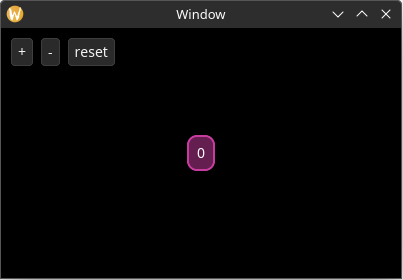
The app should now display the following:
Handle the Actions
Finally, let's add the appropriate actions to the buttons and handle them:
use yarrow::prelude::*;

#[derive(Clone)]
pub enum MyAction {
    OffsetCounterBy(i32),
    ResetCounter,
}

#[derive(Default)]
struct MyApp {
    main_window_elements: Option<MainWindowElements>,
    style: MyStyle,

    count: i32,
}

impl MyApp {
    pub fn sync_state(&mut self, cx: &mut WindowContext<'_, MyAction>) {
        let Some(elements) = &mut self.main_window_elements else {
            return;
        };

        if elements
            .hello_label
            .set_text(Some(&format!("{}", self.count)), cx.res)
        {
            // Changing the text may resize the label, so do a layout.
            elements.layout(&self.style, cx); // changed
        }
    }
}

impl Application for MyApp {
    type Action = MyAction;

    // new
    fn on_action_emitted(&mut self, cx: &mut AppContext<Self::Action>) {
        let Some(mut cx) = cx.window_context(MAIN_WINDOW) else { // 1
            return;
        };

        while let Ok(action) = cx.action_receiver.try_recv() {
            match action {
                MyAction::OffsetCounterBy(offset) => {
                    self.count += offset;
                    self.sync_state(&mut cx);
                }
                MyAction::ResetCounter => {
                    self.count = 0;
                    self.sync_state(&mut cx);
                }
            }
        }
    }

    // ...
    fn on_window_event(
        &mut self,
        event: AppWindowEvent,
        window_id: WindowID,
        cx: &mut AppContext<MyAction>,
    ) {
        match event {
            AppWindowEvent::WindowOpened => {
                if window_id == MAIN_WINDOW {
                    self.style.load(&mut cx.res);

                    let mut cx = cx.window_context(MAIN_WINDOW).unwrap();

                    self.main_window_elements =
                        Some(MainWindowElements::build(&mut cx));

                    self.sync_state(&mut cx);
                }
            }
            AppWindowEvent::WindowResized => {
                if window_id == MAIN_WINDOW {
                    let mut cx = cx.window_context(MAIN_WINDOW).unwrap();

                    self.main_window_elements
                        .as_mut()
                        .unwrap()
                        .layout(&self.style, &mut cx); // changed
                }
            }
            _ => {}
        }
    }
}

// ...

pub struct MainWindowElements {
    hello_label: Label,
    increment_btn: Button,
    decrement_btn: Button,
    reset_btn: Button,
}

impl MainWindowElements {
    pub fn build(cx: &mut WindowContext<'_, MyAction>) -> Self {
        Self {
            hello_label: Label::builder()
                .class(MyStyle::CLASS_FANCY_LABEL)
                .text("Hello World!")
                .build(cx),
            increment_btn: Button::builder()
                .text("+")
                .on_select(MyAction::OffsetCounterBy(1)) // new
                .build(cx),
            decrement_btn: Button::builder()
                .text("-")
                .on_select(MyAction::OffsetCounterBy(-1)) // new
                .build(cx),
            reset_btn: Button::builder()
                .text("reset")
                .on_select(MyAction::ResetCounter) // new
                .build(cx),
        }
    }

    pub fn layout(&mut self, style: &MyStyle, cx: &mut WindowContext<'_, MyAction>) {
        let label_size = self.hello_label.desired_size(cx.res);

        // Center the label inside the window
        let window_rect = Rect::from_size(cx.logical_size());
        let label_rect = centered_rect(window_rect.center(), label_size);

        self.hello_label.el.set_rect(label_rect);

        self.increment_btn.layout(
            point(style.window_padding.left, style.window_padding.top),
            cx.res,
        );
        self.decrement_btn.layout(
            point(
                self.increment_btn.el.rect().max_x() + style.button_spacing,
                style.window_padding.top,
            ),
            cx.res,
        );
        self.reset_btn.layout(
            point(
                self.decrement_btn.el.rect().max_x() + style.button_spacing,
                style.window_padding.top,
            ),
            cx.res,
        );
    }
}

pub struct MyStyle {
    window_padding: Padding,
    button_spacing: f32,
}

impl Default for MyStyle {
    fn default() -> Self {
        Self {
            window_padding: padding_all_same(10.0),
            button_spacing: 8.0,
        }
    }
}

impl MyStyle {
    pub const CLASS_FANCY_LABEL: ClassID = 1;

    pub fn load(&self, res: &mut ResourceCtx) {
        yarrow::theme::yarrow_dark::load(Default::default(), res);

        res.style_system.add(
            Self::CLASS_FANCY_LABEL,
            true,
            LabelStyle {
                back_quad: QuadStyle {
                    bg: background_hex(0x641e50),
                    border: border(hex(0xc83ca0), 2.0, radius(10.0)),
                    ..Default::default()
                },
                text_padding: padding_all_same(10.0),
                ..Default::default()
            },
        );
    }
}

pub fn main() {
    let (action_sender, action_receiver) = yarrow::action_channel();

    yarrow::run_blocking(MyApp::default(), action_sender, action_receiver).unwrap();
}- The
let-else patterncan be useful here again so the window context doesn't have to be extracted from the application context inside every match variant. Although note this won't work if you have multiple windows in your application.
Now run the application and count things!
Improving sync_state
One last thing, while our sync_count function is fine for this simple application, in a larger application you will probably want to only perform a single state sync and layout once for every invocation of on_action_emitted.
One strategy is to pass around a bool like this:
use yarrow::prelude::*;

#[derive(Clone)]
pub enum MyAction {
    OffsetCounterBy(i32),
    ResetCounter,
}

#[derive(Default)]
struct MyApp {
    main_window_elements: Option<MainWindowElements>,
    style: MyStyle,

    count: i32,
}

impl MyApp {
    // changed
    pub fn sync_state(&mut self, cx: &mut WindowContext<'_, MyAction>) {
        let Some(elements) = &mut self.main_window_elements else {
            return;
        };

        let mut needs_layout = false;

        if elements
            .hello_label
            .set_text(Some(&format!("{}", self.count)), cx.res)
        {
            // Changing the text may resize the label, so do a layout.
            needs_layout = true;
        }

        if needs_layout {
            elements.layout(&self.style, cx);
        }
    }
}

// ...

impl Application for MyApp {
    type Action = MyAction;

    // changed
    fn on_action_emitted(&mut self, cx: &mut AppContext<Self::Action>) {
        let Some(mut cx) = cx.window_context(MAIN_WINDOW) else {
            return;
        };

        let mut state_changed = false;

        while let Ok(action) = cx.action_receiver.try_recv() {
            match action {
                MyAction::OffsetCounterBy(offset) => {
                    self.count += offset;
                    state_changed = true;
                }
                MyAction::ResetCounter => {
                    self.count = 0;
                    state_changed = true;
                }
            }
        }

        if state_changed {
            self.sync_state(&mut cx);
        }
    }

    fn on_window_event(
        &mut self,
        event: AppWindowEvent,
        window_id: WindowID,
        cx: &mut AppContext<MyAction>,
    ) {
        match event {
            AppWindowEvent::WindowOpened => {
                if window_id == MAIN_WINDOW {
                    self.style.load(&mut cx.res);

                    let mut cx = cx.window_context(MAIN_WINDOW).unwrap();

                    self.main_window_elements =
                        Some(MainWindowElements::build(&mut cx));

                    self.sync_state(&mut cx);
                }
            }
            AppWindowEvent::WindowResized => {
                if window_id == MAIN_WINDOW {
                    let mut cx = cx.window_context(MAIN_WINDOW).unwrap();

                    self.main_window_elements
                        .as_mut()
                        .unwrap()
                        .layout(&self.style, &mut cx);
                }
            }
            _ => {}
        }
    }
}

pub struct MainWindowElements {
    hello_label: Label,
    increment_btn: Button,
    decrement_btn: Button,
    reset_btn: Button,
}

impl MainWindowElements {
    pub fn build(cx: &mut WindowContext<'_, MyAction>) -> Self {
        Self {
            hello_label: Label::builder()
                .class(MyStyle::CLASS_FANCY_LABEL)
                .text("Hello World!")
                .build(cx),
            increment_btn: Button::builder()
                .text("+")
                .on_select(MyAction::OffsetCounterBy(1))
                .build(cx),
            decrement_btn: Button::builder()
                .text("-")
                .on_select(MyAction::OffsetCounterBy(-1))
                .build(cx),
            reset_btn: Button::builder()
                .text("reset")
                .on_select(MyAction::ResetCounter)
                .build(cx),
        }
    }

    pub fn layout(&mut self, style: &MyStyle, cx: &mut WindowContext<'_, MyAction>) {
        let label_size = self.hello_label.desired_size(cx.res);

        // Center the label inside the window
        let window_rect = Rect::from_size(cx.logical_size());
        let label_rect = centered_rect(window_rect.center(), label_size);

        self.hello_label.el.set_rect(label_rect);

        self.increment_btn.layout(
            point(style.window_padding.left, style.window_padding.top),
            cx.res,
        );
        self.decrement_btn.layout(
            point(
                self.increment_btn.el.rect().max_x() + style.button_spacing,
                style.window_padding.top,
            ),
            cx.res,
        );
        self.reset_btn.layout(
            point(
                self.decrement_btn.el.rect().max_x() + style.button_spacing,
                style.window_padding.top,
            ),
            cx.res,
        );
    }
}

pub struct MyStyle {
    window_padding: Padding,
    button_spacing: f32,
}

impl Default for MyStyle {
    fn default() -> Self {
        Self {
            window_padding: padding_all_same(10.0),
            button_spacing: 8.0,
        }
    }
}

impl MyStyle {
    pub const CLASS_FANCY_LABEL: ClassID = 1;

    pub fn load(&self, res: &mut ResourceCtx) {
        yarrow::theme::yarrow_dark::load(Default::default(), res);

        res.style_system.add(
            Self::CLASS_FANCY_LABEL,
            true,
            LabelStyle {
                back_quad: QuadStyle {
                    bg: background_hex(0x641e50),
                    border: border(hex(0xc83ca0), 2.0, radius(10.0)),
                    ..Default::default()
                },
                text_padding: padding_all_same(10.0),
                ..Default::default()
            },
        );
    }
}

pub fn main() {
    let (action_sender, action_receiver) = yarrow::action_channel();

    yarrow::run_blocking(MyApp::default(), action_sender, action_receiver).unwrap();
}
And again, it's up to you how fine-grained and optimized you want your state synchronization and layout to be. You are in control!
The full source code of the completed tutorial can be found here.
Element Z Indexes
Elements do NOT always render in the same order they were added. Instead, elements are simply sorted by their "Z Index", with lower z index values appearing below higher z index values.
An element's z index can be set from either the .z_index() property in the element's builder or from the .el.set_z_index() method on the element's handle.
Mouse Events
The z index also affects the order in which elements in the application receive mouse events. Elements with a higher z index value get sent a mouse event before elements with a lower z index. If an element with a higher z index "captures" the mouse event, then elements with a lower z index will not receive that mouse event.
Builder Shorthands
Setting the z index on every single element builder can be cumbersome. Luckily, a WindowContext has a concept of a "z index stack" where elements that don't have a defined z index will fall back to the most recently pushed z index on that stack. For example:
pub fn my_builder(cx: &mut WindowContext<'_, MyAction>) -> Self {
    // This element will have the default z index of "0".
    let label1 = Label::builder().build(cx);

    cx.push_z_index(5);

    // These elements will have a z index of "5".
    let label2 = Label::builder().build(cx);
    let label3 = Label::builder().build(cx);

    // This element will have a z index of "20".
    let label4 = Label::builder().z_index(20).build(cx);

    // This element will have a z index of "5".
    let label5 = Label::builder().build(cx);

    cx.push_z_index(10);

    // This element will have a z index of "10".
    let label6 = Label::builder().build(cx);

    cx.pop_z_index();

    // This element will have a z index of "5".
    let label7 = Label::builder().build(cx);

    cx.pop_z_index();

    // This element will have the default z index of "0".
    let label8 = Label::builder().build(cx);
}
Yarrow also includes a with_z_index method that automatically calls cx.push_z_index() and cx.pop_z_index() for you:
pub fn my_builder(cx: &mut WindowContext<'_, MyAction>) -> Self {
    // This element will have the default z index of "0".
    let label1 = Label::builder().build(cx);

    let (label2, label3) = cx.with_z_index(5, |cx| {
        // These elements will have a z index of "5".
        let label2 = Label::builder().build(cx);
        let label3 = Label::builder().build(cx);

        (label2, label3)
    });

    // This element will have the default z index of "0".
    let label4 = Label::builder().build(cx);
}
There is also a with_z_index_and_scissor_rect method that lets you set both a z index and a scissoring rectangle ID at once.
Performance Considerations
Currently, Yarrow treats each z index as a separate batch of primitives to send to the GPU. To keep the number of GPU draw calls and GPU memory usage down to a minimum, use as few z indexes in your application as possible.
In some cases, strategically grouping elements together into different z indexes can actually improve performance, especially with elements that have expensive text and mesh primitives. If elements that update/animate frequently are grouped into one z index and elements that rarely update are grouped into a different z index, then Yarrow/RootVG can skip preparing a batch of primitives for the rarely-updating elements whenever a frequently-updated element updates.
An optimization may be added to Yarrow/RootVG in the future to automatically batch non-overlapping primitives together to reduce GPU draw calls and GPU memory usage (and the ability to turn this feature off for certain arbitrary z indexes). I haven't gotten around to it yet, and I want to wait and see if it's even a necessary optimization.
Scissoring Rectangles
Yarrow does not have a concept of "parent"/"container" elements like most GUI libraries do. This means you cannot just put elements inside of a ScrollArea element.
Instead, to create a scroll area, Yarrow first has you assign elements to "scissoring rectangles". Elements that are not manually assigned a scissoring rectangle will use the "default scissoring rectangle" which is just the entire window.
Defining Scissoring Rectangles
Each scissoring rectangle is manually assigned an integer "ID". This ID can be any u32 value (expect for u32::MAX which is reserved for the "default scissoring rectangle" that covers the whole window).
Define the scissoring rectangles you wish to use as a set of constants (or alternatively as an enum). For example:
pub const SIDE_PANEL_SRECT: ScissorRectID = ScissorRectID(0);
pub const TAB_A_CONTENT_SRECT: ScissorRectID = ScissorRectID(1);
pub const TAB_B_CONTENT_SRECT: ScissorRectID = ScissorRectID(2);
Yarrow does not have a concept of "nested" scissoring rectangles. This would have made the library implementation a lot more complex so I decided against it.
Assigning Scissoring Rectangles to Elements
Scissoring rectangles can only be assigned to elements in their builders. Once an element is assigned a scissoring rectangle, it cannot be assigned to a different one.
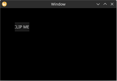
Here is a quick example of a text input being assigned to a scissoring rectangle and being clipped:
use yarrow::prelude::*;

pub fn main() {
    let (action_sender, action_receiver) = yarrow::action_channel();
    yarrow::run_blocking(MyApp::default(), action_sender, action_receiver).unwrap();
}

#[derive(Default)]
struct MyApp {
    main_window_elements: Option<MainWindowElements>,
}

impl Application for MyApp {
    type Action = ();

    fn on_window_event(
        &mut self,
        event: AppWindowEvent,
        window_id: WindowID,
        cx: &mut AppContext<()>,
    ) {
        match event {
            AppWindowEvent::WindowOpened => {
                if window_id == MAIN_WINDOW {
                    yarrow::theme::yarrow_dark::load(Default::default(), &mut cx.res);
                    let mut cx = cx.window_context(MAIN_WINDOW).unwrap();
                    self.main_window_elements = Some(MainWindowElements::build(&mut cx));
                }
            }
            _ => {}
        }
    }
}

pub const MY_SRECT: ScissorRectID = ScissorRectID(0);

pub struct MainWindowElements {
    text_input: TextInput,
}

impl MainWindowElements {
    pub fn build(cx: &mut WindowContext<'_, ()>) -> Self {
        // The position and size of the scissoring rectangle can be set at any time.
        cx.view.update_scissor_rect(
            MY_SRECT,
            Some(rect(50.0, 50.0, 50.0, 30.0)),
            None, // new_scroll_offset
        );

        Self {
            text_input: TextInput::builder()
                .text("CLIP ME!!!")
                .rect(rect(0.0, 0.0, 100.0, 30.0)) // 1
                // Assign this element to the scissoring rectangle.
                .scissor_rect(MY_SRECT)
                .build(cx)
        }
    }
}- NOTE: The position of an element is relative to the origin of its assigned scissoring rectangle, so this element will appear to be at the position
(50.0, 50.0).

Scroll Offset
Scissoring rectangles also have a "scroll offset" vector which can be used to "scroll" the contents.
If we set the scroll offset vector from the example above, notice how the element appeared to have been scrolled 10 points to the left and now has its left side clipped:
use yarrow::prelude::*;

pub fn main() {
    let (action_sender, action_receiver) = yarrow::action_channel();
    yarrow::run_blocking(MyApp::default(), action_sender, action_receiver).unwrap();
}

#[derive(Default)]
struct MyApp {
    main_window_elements: Option<MainWindowElements>,
}

impl Application for MyApp {
    type Action = ();

    fn on_window_event(
        &mut self,
        event: AppWindowEvent,
        window_id: WindowID,
        cx: &mut AppContext<()>,
    ) {
        match event {
            AppWindowEvent::WindowOpened => {
                if window_id == MAIN_WINDOW {
                    yarrow::theme::yarrow_dark::load(Default::default(), &mut cx.res);
                    let mut cx = cx.window_context(MAIN_WINDOW).unwrap();
                    self.main_window_elements = Some(MainWindowElements::build(&mut cx));
                }
            }
            _ => {}
        }
    }
}

pub const MY_SRECT: ScissorRectID = ScissorRectID(0);

pub struct MainWindowElements {
    text_input: TextInput,
}

impl MainWindowElements {
    pub fn build(cx: &mut WindowContext<'_, ()>) -> Self {
        cx.view.update_scissor_rect(
            MY_SRECT,
            Some(rect(50.0, 50.0, 50.0, 30.0)),
            // Scroll horizontally by 10.0 points.
            Some(Vector::new(10.0, 0.0)), // changed
        );

        Self {
            text_input: TextInput::builder()
                .text("CLIP ME!!!")
                // NOTE: The position of an element is relative to the origin of its
                // assigned scissoring rectangle, so this element will appear to be
                // at the position `(50.0, 50.0)`.
                .rect(rect(0.0, 0.0, 100.0, 30.0))
                // Assign this element to the scissoring rectangle.
                .scissor_rect(MY_SRECT)
                .build(cx)
        }
    }
}
Scroll Areas
You probably want to add a scrollbar and have the scroll offset change via the mouse's scroll wheel. To do this, you use the ScrollArea element in Yarrow.
As an added bonus, you can set a ScrollArea element to "control" a scissoring rectangle, meaning that it will automatically update the scissoring rectangle's position, size, and scroll offset to match that of the ScrollArea element.
Here's an example of a ScrollArea element:
use yarrow::prelude::*;

pub fn main() {
    let (action_sender, action_receiver) = yarrow::action_channel();
    yarrow::run_blocking(MyApp::default(), action_sender, action_receiver).unwrap();
}

pub const CONTENT_SRECT: ScissorRectID = ScissorRectID(0);

#[derive(Default)]
struct MyApp {
    main_window_elements: Option<MainWindowElements>,
}

impl Application for MyApp {
    type Action = ();

    fn on_window_event(
        &mut self,
        event: AppWindowEvent,
        window_id: WindowID,
        cx: &mut AppContext<()>,
    ) {
        match event {
            AppWindowEvent::WindowOpened => {
                if window_id == MAIN_WINDOW {
                    yarrow::theme::yarrow_dark::load(Default::default(), &mut cx.res);

                    let mut cx = cx.window_context(MAIN_WINDOW).unwrap();

                    self.main_window_elements =
                        Some(MainWindowElements::build(&mut cx));
                    self.main_window_elements.as_mut().unwrap().layout(&mut cx);
                }
            }
            AppWindowEvent::WindowResized => {
                if window_id == MAIN_WINDOW {
                    let mut cx = cx.window_context(MAIN_WINDOW).unwrap();

                    self.main_window_elements.as_mut().unwrap().layout(&mut cx);
                }
            }
            _ => {}
        }
    }
}

pub struct MainWindowElements {
    long_boi: TextInput,
    scroll_area: ScrollArea,
}

impl MainWindowElements {
    pub fn build(cx: &mut WindowContext<'_, ()>) -> Self {
        Self {
            long_boi: TextInput::builder()
                .text("L0ng b0I")
                .scissor_rect(CONTENT_SRECT)
                .build(cx),
            scroll_area: ScrollArea::builder()
                // Set the z index higher than the contents so that it has
                // priority on mouse events.
                .z_index(1)
                // Set the scissoring rectangle that this element should control.
                .control_scissor_rect(CONTENT_SRECT)
                // Note, do *NOT* assign the scroll area element itself to the
                // scissoring rectangle it controls, or it will not function
                // properly.
                .scissor_rect(ScissorRectID::DEFAULT)
                .build(cx),
        }
    }

    pub fn layout(&mut self, cx: &mut WindowContext<'_, ()>) {
        // Assign the scroll area element to fill the area we want (in this
        // case the entire window).
        self.scroll_area
            .el
            .set_rect(Rect::from_size(cx.logical_size()));

        // Layout the elements like normal.
        //
        // NOTE: The position of an element is relative to the origin of its
        // assigned scissoring rectangle. So if the position of the rectangle
        // of `self.scroll_area` was `(50.0, 70.0)`, then the position of this
        // element will be offset by that amount.
        self.long_boi.el.set_rect(rect(20.0, 20.0, 200.0, 1000.0));

        // Set the "content size" of the scroll area. In this case we want it
        // to cover the size of our elements with a bit of padding.
        self.scroll_area.set_content_size(Size::new(
            self.long_boi.el.rect().max_x() + 20.0,
            self.long_boi.el.rect().max_y() + 20.0,
        ));
    }
}
Builder Shorthands
Setting the scissoring rectangle on every single element builder can be cumbersome. Luckily, a WindowContext has a concept of a "scissoring rectangle stack" where elements that don't have a defined scissoring rectangle will fall back to the most recently pushed scissoring rectangle on that stack. For example:
pub fn my_builder(cx: &mut WindowContext<'_, MyAction>) -> Self {
    // This element will be assigned to the "default scissoring rectangle"
    // that covers the whole window.
    let label1 = Label::builder().build(cx);

    cx.push_scissor_rect(ScissorRectID(5));

    // These elements will be assigned to the scissoring rectangle with
    // ID "5".
    let label2 = Label::builder().build(cx);
    let label3 = Label::builder().build(cx);

    // This elements will be assigned to the scissoring rectangle with
    // ID "20".
    let label4 = Label::builder()
        .scissor_rect(ScissorRectID(20))
        .build(cx);

    // This elements will be assigned to the scissoring rectangle with
    // ID "5".
    let label5 = Label::builder().build(cx);

    cx.push_scissor_rect(ScissorRectID(10));

    // This elements will be assigned to the scissoring rectangle with
    // ID "10".
    let label6 = Label::builder().build(cx);

    cx.pop_scissor_rect();

    // This elements will be assigned to the scissoring rectangle with
    // ID "5".
    let label7 = Label::builder().build(cx);

    cx.pop_scissor_rect();

    // This element will be assigned to the "default scissoring rectangle"
    // that covers the whole window.
    let label8 = Label::builder().build(cx);
}
Yarrow also includes a with_scissor_rect method that automatically calls cx.push_scissor_rect() and cx.pop_scissor_rect() for you:
pub fn my_builder(cx: &mut WindowContext<'_, MyAction>) -> Self {
    // This element will be assigned to the "default scissoring rectangle"
    // that covers the whole window.
    let label1 = Label::builder().build(cx);

    let (label2, label3) = cx.with_scissor_rect(ScissorRectID(5), |cx| {
        // These elements will be assigned to the scissoring rectangle with
        // ID "5".
        let label2 = Label::builder().build(cx);
        let label3 = Label::builder().build(cx);

        (label2, label3)
    });

    // This element will be assigned to the "default scissoring rectangle"
    // that covers the whole window.
    let label4 = Label::builder().build(cx);
}
There is also a with_z_index_and_scissor_rect method that lets you set both a z index and a scissoring rectangle ID at once.
Custom Elements
This chapter is a WIP
This chapter will guide you through the process of creating a custom element from scratch. This element will render a few shapes and animate them when the user clicks on it or presses a key.
An element in Yarrow is composed of three to four parts: The builder, the element itself, a handle to the element, and (optionally) a style struct for the element.
Custom Elements: Style Struct
Let's start with the easiest concept: the custom style struct for your element.
The style struct simply defines how your element will be rendered. It contains properties like colors, borders, text properties, padding around content, etc. Anything that makes sense to put into a "style sheet" can go here.
You also don't need a style struct if you don't want one, i.e. if your element doesn't paint anything to the screen or if you only have a single supported theme in your application.
There are no hard and fast rules on what fields to put in your style struct, however there are things you can do to make it easier for your end users to use.
Defining the Style Struct
Let us define the style of our custom element as follows:
#[derive(Debug, Clone, PartialEq)]
pub struct MyCustomElementStyle {
    // The size of a single shape in this element (one side of a square).
    pub shape_size: f32,

    // The spacing between shapes.
    pub shape_spacing: f32,

    // The style of the quad shape.
    pub quad_style: QuadStyle,
    // The style of the quad shape when the mouse is hovered over
    // the element.
    pub quad_style_hover: QuadStyle,

    // The color of the mesh shape.
    pub mesh_color: RGBA8,
    // The color of the mesh shape when the mouse is hovered over
    // the element.
    pub mesh_color_hover: RGBA8,

    // The duration of the animation.
    pub anim_duration: Duration,
}

impl Default for MyCustomElementStyle {
    fn default() -> Self {
        Self {
            shape_size: 30.0,
            shape_spacing: 15.0,
            quad_style: QuadStyle {
                bg: Background::Solid(rgb(0xaa, 0xaa, 0xaa)),
                border: BorderStyle::default(),
                flags: Default::default(),
            },
            quad_style_hover: QuadStyle {
                bg: Background::Solid(rgb(0xee, 0xee, 0xee)),
                border: BorderStyle::default(),
                flags: Default::default(),
            },
            mesh_color: rgb(0, 200, 100),
            mesh_color_hover: rgb(0, 255, 100),
            anim_duration: Duration::from_secs(1),
        }
    }
}
Fallback Properties
While the above struct is fine, if this element is meant to be easy and flexible for end users then it may be a good idea to use "fallback properties". This allows users to use the..Default::default() constructor pattern in Rust and not have to duplicate properties they do not use.
While we're at it, let's set the default colors to TRANSPARENT so that shapes users don't use don't appear.
#[derive(Debug, Clone, PartialEq)]
pub struct MyCustomElementStyle {
    // The size of a single shape in this element (one side of a square).
    pub shape_size: f32,

    // The spacing between shapes.
    pub shape_spacing: f32,

    // The style of the quad shape.
    pub quad_style: QuadStyle,
    // The style of the quad shape when the mouse is hovered over
    // the element.
    //
    // If this is `None`, then this will fall back to `quad_style`.
    pub quad_style_hover: Option<QuadStyle>, // changed

    // The color of the mesh shape.
    pub mesh_color: RGBA8,
    // The color of the mesh shape when the mouse is hovered over
    // the element.
    //
    // If this is `None`, then this will fall back to `mesh_color`.
    pub mesh_color_hover: Option<RGBA8>,

    // The duration of the animation.
    pub anim_duration: Duration,
}

impl Default for MyCustomElementStyle {
    fn default() -> Self {
        Self {
            shape_size: 30.0,
            shape_spacing: 15.0,
            quad_style: QuadStyle::TRANSPARENT, // changed
            quad_style_hover: None, // changed
            mesh_color: color::TRANSPARENT, // changed
            mesh_color_hover: None, // changed
            anim_duration: Duration::from_secs(1),
        }
    }
}
If you want to go further, you can extract the properties inside of
QuadStyleand provide fallbacks for each individual property to make it even easier for the user to omit properties they do not use. Take a look at the implementation of Yarrow'sButtonfor an example.
The ElementStyle Trait
But if all of the colors are set to transparent, where do we define a sane default? We also need some way to register our custom style struct to Yarrow's style system.
This is where the ElementStyle trait comes in.
impl ElementStyle for MyCustomElementStyle {
    const ID: &'static str = "mylib_myelement"; // 1

    fn default_dark_style() -> Self {
        Self {
            quad_style: QuadStyle {
                bg: Background::Solid(rgb(0xaa, 0xaa, 0xaa)),
                border: BorderStyle::default(),
                flags: Default::default(),
            },
            quad_style_hover: Some(QuadStyle {
                bg: Background::Solid(rgb(0xee, 0xee, 0xee)),
                border: BorderStyle::default(),
                flags: Default::default(),
            }),
            mesh_color: rgb(0, 200, 100),
            mesh_color_hover: Some(rgb(0, 255, 100)),
            ..Default::default()
        }
    }

    fn default_light_style() -> Self {
        Self {
            quad_style: QuadStyle {
                bg: Background::Solid(rgb(0x22, 0x22, 0x22)),
                border: BorderStyle::default(),
                flags: Default::default(),
            },
            quad_style_hover: Some(QuadStyle {
                bg: Background::Solid(rgb(0x33, 0x33, 0x33)),
                border: BorderStyle::default(),
                flags: Default::default(),
            }),
            mesh_color: rgb(0, 100, 50),
            mesh_color_hover: Some(rgb(0, 150, 50)),
            ..Default::default()
        }
    }
}- The unique identifier for this style struct. To avoid potential conflicts with Yarrow's built in styles and other third-party crates, prefix it with the name of your app/library.
Also notice how you can now define a separate default style for dark mode or light mode. Neat!
Custom Elements: Builder
Elements in yarrow should use the builder pattern in Rust.
Let's start by defining the builder struct:
pub struct MyCustomElementBuilder<A: Clone + 'static> { // 1
    pub on_selected_action: Option<A>, // 2
    pub disabled: bool, // 3

    // 4
    pub class: Option<ClassID>,
    pub z_index: Option<ZIndex>,
    pub rect: Rect,
    pub manually_hidden: bool,
    pub scissor_rect_id: Option<ScissorRectID>,
}- The
<A: Clone 'static>is a generic for the user'sActiontype. If your element emits an action then it needs this generic. - The action that should be emitted when the user selects this element. This can also be
Nonemeaning the user does not wish to emit an action. - Whether or not this element should be disabled when created. This "disabled" bool is our element's only custom state. (But you can of course add whatever custom state you need.)
- A bunch of other fields that most elements should contain (with a few exceptions*). If this was C++ land we could have derived a base class to avoid duplicating this code, but alas this is crab country. 🦀
* If your element doesn't have a style struct, then you don't need the
classfield. Also, some special case elements such as Yarrow'sDropDownMenu,Tooltip, andFloatingTextInputelements don't have arectfield in their builder since layout is always done after the fact. (Some of them also contain their own custom layout state.)
Now set up the builder pattern:
impl<A: Clone + 'static> MyCustomElementBuilder<A> {
    pub fn new() -> Self {
        Self {
            on_selected_action: None,
            disabled: false,
            class: None,
            z_index: None,
            rect: Default::default(),
            manually_hidden: false,
            scissor_rect_id: None,
        }
    }

    /// The action to emit when this element is selected (clicked or key pressed)
    pub fn on_select(mut self, action: A) -> Self {
        self.on_selected_action = Some(action);
        self
    }

    /// Whether or not this element is in the disabled state
    pub fn disabled(mut self, disabled: bool) -> Self {
        self.disabled = disabled;
        self
    }

    /// The style class ID
    ///
    /// If this method is not used, then the current class from the window context will
    /// be used.
    pub fn class(mut self, class: ClassID) -> Self {
        self.class = Some(class);
        self
    }

    /// The z index of the element
    ///
    /// If this method is not used, then the current z index from the window context will
    /// be used.
    pub fn z_index(mut self, z_index: ZIndex) -> Self {
        self.z_index = Some(z_index);
        self
    }

    /// The bounding rectangle of the element
    ///
    /// If this method is not used, then the element will have a size and position of
    /// zero and will not be visible until its bounding rectangle is set.
    pub fn rect(mut self, rect: Rect) -> Self {
        self.rect = rect;
        self
    }

    /// Whether or not this element is manually hidden
    ///
    /// By default this is set to `false`.
    pub fn hidden(mut self, hidden: bool) -> Self {
        self.manually_hidden = hidden;
        self
    }

    /// The ID of the scissoring rectangle this element belongs to.
    ///
    /// If this method is not used, then the current scissoring rectangle ID from the
    /// window context will be used.
    pub fn scissor_rect(mut self, scissor_rect_id: ScissorRectID) -> Self {
        self.scissor_rect_id = Some(scissor_rect_id);
        self
    }

    // TODO: Return the element handle.
    pub fn build(self, cx: &mut WindowContext<'_, A>) -> () {
        todo!()
    }
}
Action Closures
If actions should change based on the state of your element, then consider using action closures. For example, the Toggle element has its action closure defined like this:
pub struct ToggleButtonBuilder<A: Clone + 'static> {
    pub action: Option<Box<dyn FnMut(bool) -> A>>,
    // ...
}

impl<A: Clone + 'static> ToggleButtonBuilder<A> {
    // ...

    /// The action that gets emitted when the user selects/toggles this element.
    ///
    /// The data in the closure contains the new toggle state
    /// (`true` = on, `false` = off).
    pub fn on_toggled<F: FnMut(bool) -> A + 'static>(mut self, f: F) -> Self {
        self.action = Some(Box::new(f));
        self
    }

    // ...
}
For more information about how Rust closures work, see https://doc.rust-lang.org/book/ch13-01-closures.html
Custom Elements: Implementation
There is a lot to the actual implementation of the element itself, so this part is broken into sub-sections.
Custom Elements: Construction
Let's start by defining the actual element itself, as well as the state it will share with its handle.
Note that we are calling this
MyCustomElementElementand notMyCustomElement, and that we are not even making it public. This is because in Yarrow, it's the element handles that get the short clean name since handles are what the user interacts with.
use std::{rc::Rc, cell::RefCell};

struct MyCustomElementElement<A: Clone + 'static> {
    on_selected_action: Option<A>,
    time_animated: Duration, // 1
    shared_state: Rc<RefCell<SharedState>>, // 2
}

struct SharedState {
    disabled: bool,
}- We need a bit of internal state to keep track of the time elapsed in the animation.
- Our shared state is wrapped in an
Rc<RefCell<T>>. For more information on this interior mutability pattern, see https://doc.rust-lang.org/book/ch15-05-interior-mutability.html#having-multiple-owners-of-mutable-data-by-combining-rct-and-refcellt.
Yarrow is designed to be single-threaded only for simplicity. While in theory Yarrow could make use of multi-threaded processing, I would rather wait and see if this kind of optimization is even necessary before adding a bunch of complexity to both the library implementation and user's custom elements.
The Element Constructor
[TODO]